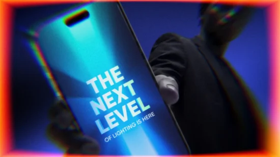

LED Light Therapy Mask

Research • Identity • Amazon Marketplace • Web Store • Promotions
Infographics • Website Heroes (Static & Video) • Emails • Iconography
Nanoleaf: Marketplace visual identity for the first product in a wellness category.
Graphic Design, Art Direction

PRODUCT
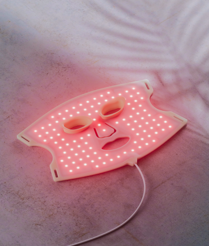
Nanoleaf is always experimenting with new product concepts. Using their expertise in lighting, the LED Face Mask became the natural first step beyond gaming lights into the wellness category.
CHALLENGE
The main hurdle was differentiation: Nanoleaf’s key sales channels, especially Amazon, were already saturated with similar offerings. Making the mask stand out from the rest was essential. Another challenge was the audience shift: wellness buyers differed sharply from Nanoleaf’s predominantly male, gaming-focused base.
APPROACH
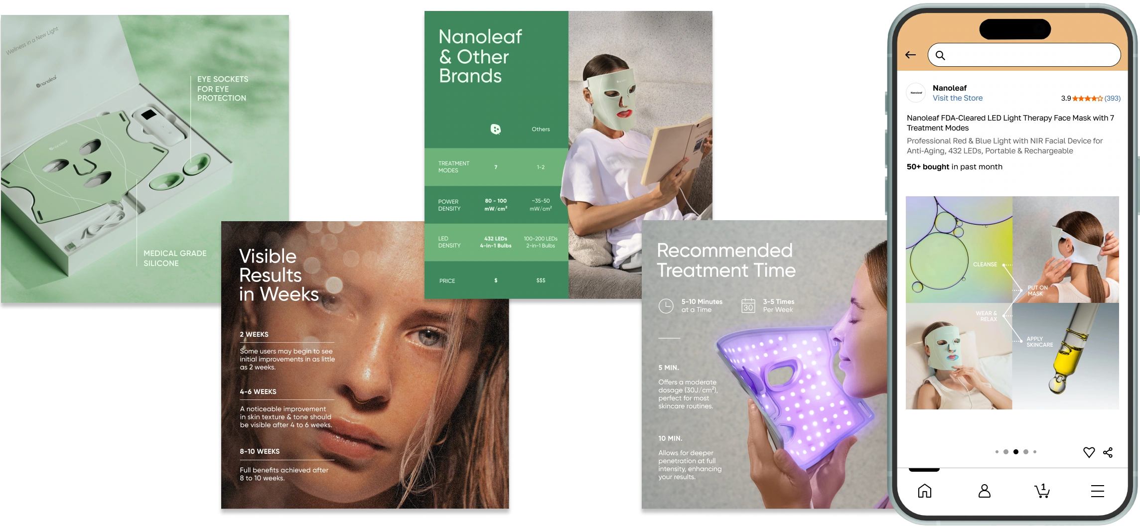
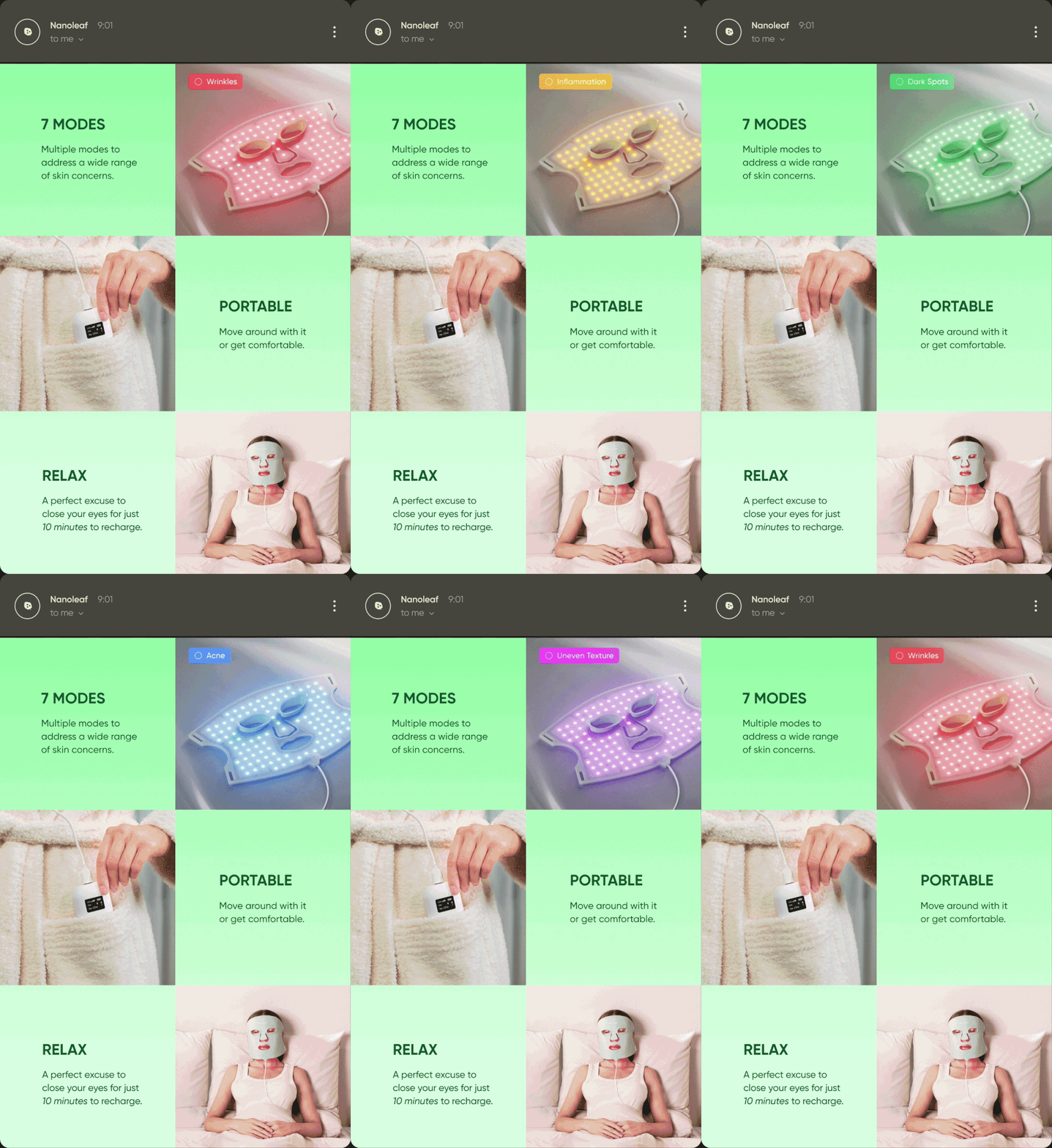
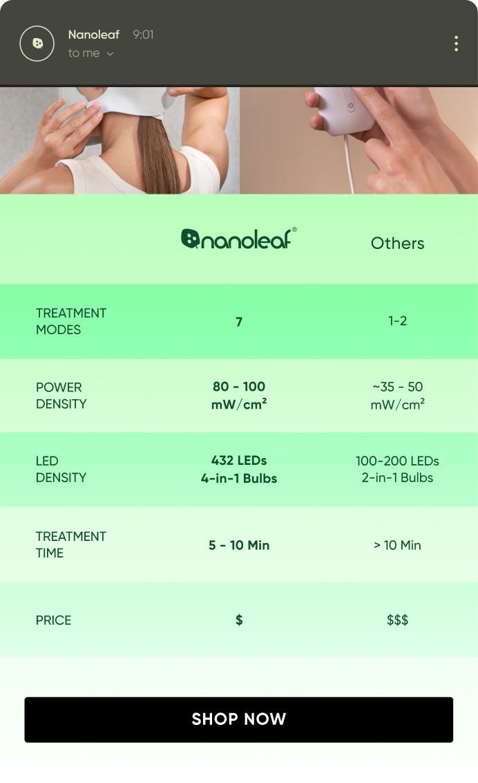
A competitor visual identity analysis revealed a clear pattern: common styling choices on Amazon made most of the similar products look untrustworthy and low-quality. To build credibility for the Mask, the strategy centered on highlighting its distinctive features and adopting a cleaner aesthetic.
DESIGN
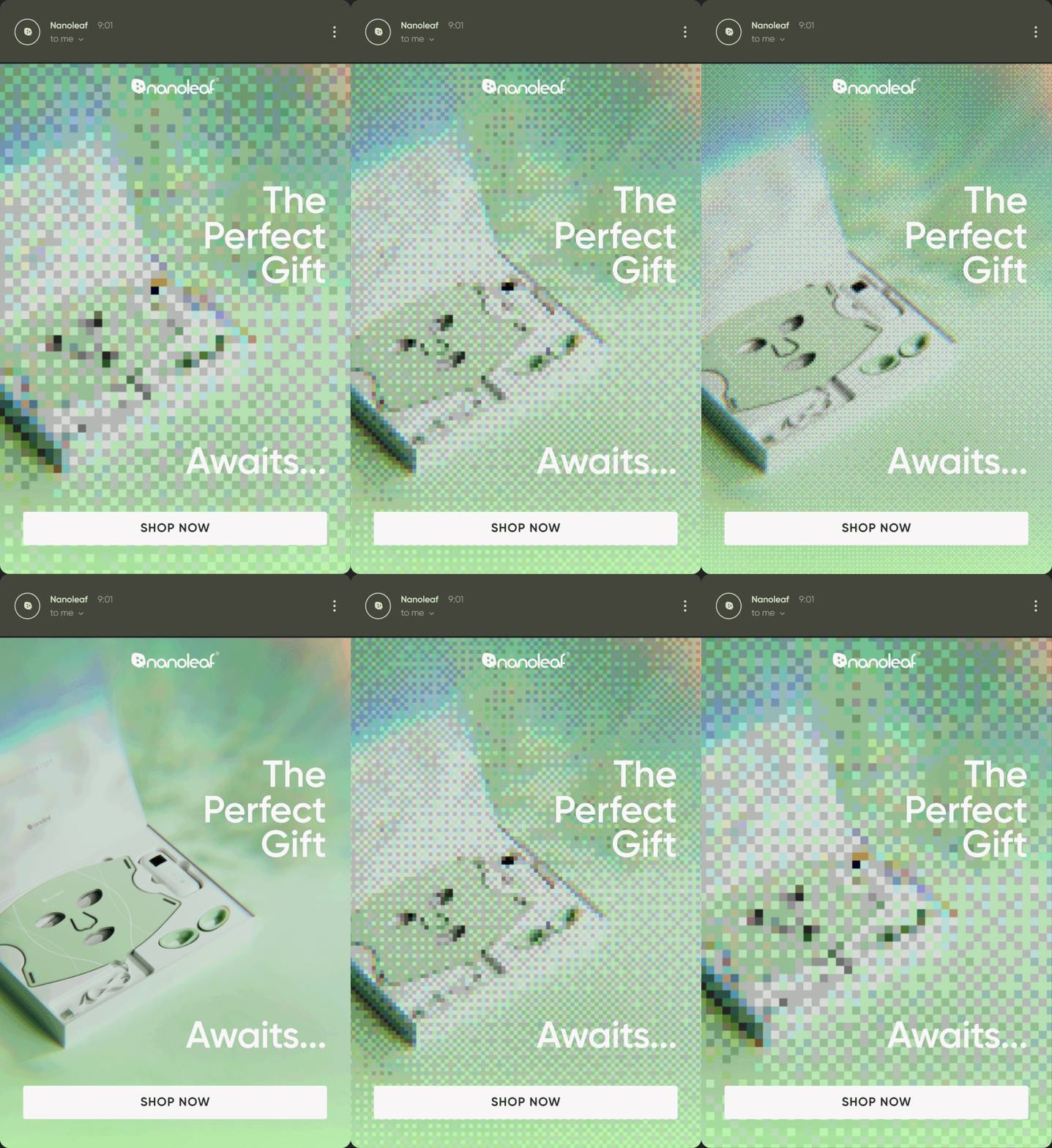
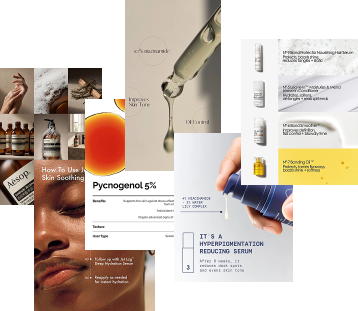
The design leaned into minimalist skincare-brand styling (The Ordinary, Aesop) to:
1) appeal to the wellness category’s core audience, largely younger women interested in current skincare trends;
2) visually position the Mask as an important new step in a skincare routine;
3) preserve elements of Nanoleaf’s own visual identity within that clean skincare aesthetic.